Charting Patterns PDF Free Download
In this post, I’ll walk you through the essential chart patterns every aspiring trader should know. Once you get the hang of these, you’ll be able to level up your technical analysis, make smarter trading decisions, and boost your chances of success in the markets.

- expertise:
- Platform Testing, Cryptocurrency, Retail Investing
- credentials:
- Active investor since 2013 · 11+ years experience
- tested:
- 50+ platforms · 200+ guides authored

- expertise:
- Broker Comparison, ISA Strategy, Portfolio Management
- credentials:
- Active investor since 2013 · 11+ years experience
- tested:
- 40+ brokers with funded accounts
How We Test
Real accounts. Real money. Real trades. No demo accounts or press releases.
What we measure:
- Spreads vs advertised rates
- Execution speed and slippage
- Hidden fees (overnight, withdrawal, conversion)
- Actual withdrawal times
Scoring:
Fees (25%) · Platform (20%) · Assets (15%) · Mobile (15%) · Tools (10%) · Support (10%) · Regulation (5%)
Regulatory checks:
FCA Register verification · FSCS protection
Testing team:
Adam Woodhead (investing since 2013), Thomas Drury (Chartered ACII, 2018), Dom Farnell (investing since 2013) — 50+ platforms with funded accounts
Quarterly reviews · Corrections: info@theinvestorscentre.co.uk
Disclaimer
Not financial advice. Educational content only. We're not FCA authorised. Consult a qualified advisor before investing.
Capital at risk. Investments can fall. Past performance doesn't guarantee future results.
CFD warning. 67-84% of retail accounts lose money trading CFDs. High risk due to leverage.
Contact: info@theinvestorscentre.co.uk
Quick Answer: How to Trade Chart Patterns
Chart patterns are graphical formations on price charts that help traders predict future market movements based on historical price data. This guide covers 11 essential trading chart patterns for 2026, including how to identify them, trade them, and manage risk effectively. Patterns fall into three main categories: continuation, reversal, and bilateral. Each pattern in this guide includes a custom diagram, a step-by-step trading approach, and a real-world market example from 2023–2025 to show you exactly how these formations play out in live conditions.
Disclaimer
Trading chart patterns are tools used in technical analysis to identify potential market trends and price movements. However, they do not guarantee success in trading and should not be relied upon as the sole basis for trading decisions. The effectiveness of chart patterns can vary depending on market conditions and individual interpretation. Always conduct thorough research and combine chart patterns with other forms of analysis, such as fundamental analysis and risk management strategies. Trading in financial markets carries risks, and you should only invest money that you can afford to lose. Consult a financial advisor if necessary.
How to Download our Chart Patterns PDF?
- Click the link below.
- This will initiate your download.
- Please do read the rest of this our Trading Chart Patterns page, which explains how to spot these patterns and how to trade them.
Here are the Top Trading Chart Patterns Traders Should Know:
Where Can I Trade Chart Patterns in the UK?
You can trade chart patterns with leading FCA-regulated brokers in the UK. Here are some top choices:
- IG – Trading Score: 4.8/5 – Visit IG (68% of Retail CFD Accounts Lose Money)
- Interactive Brokers – Trading Score: 4.9/5 – Visit Interactive Brokers (62.5% of Retail CFD Accounts Lose Money)
- Spreadex – Trading Score: 4.7/5 – Visit Spreadex (65% of retail CFD accounts lose money.)
What is a Trading Chart Pattern?
A trading chart pattern is a graphical representation of price movements in the financial markets, formed by historical price data plotted on a chart. These patterns emerge because markets are driven by human psychology — and human behaviour tends to repeat itself. Fear, greed, indecision, and momentum manifest in recurring shapes on a price chart, which is why the same patterns appear across stocks, forex, crypto, commodities, and indices.
Chart patterns are central to technical analysis, giving traders a visual framework to assess market sentiment, anticipate potential price direction, and structure trades with defined entry, stop-loss, and profit target levels. Used alongside volume analysis, support and resistance, and momentum indicators, they become a powerful part of any trading strategy.
It is worth noting that no pattern is infallible. The market does not always follow the textbook setup, and patterns that fail to complete — known as failed patterns or false breakouts — can themselves be powerful signals. An experienced trader learns to read both what a pattern suggests and what it means when that suggestion breaks down.
What Are the Main Types of Chart Patterns?
Most chart patterns fall into three main categories: continuation, reversal, and bilateral. Understanding which category a pattern belongs to is the first step to trading it correctly, because the category tells you whether you are trading with the current trend, against it, or waiting for the market to make up its mind.
Continuation patterns signal that the current trend is likely to keep going. Think of flags, pennants, and symmetrical triangles. These usually show up during short pauses in the market — a period of consolidation where participants catch their breath — before momentum picks back up in the original direction. The key with continuation patterns is patience: entering too early, before the pattern completes and price breaks out, is one of the most common mistakes traders make.
Reversal patterns hint that a trend might be coming to an end and a new one is beginning. Classic examples include head and shoulders, double tops, and double bottoms. When these form after a sustained move, it is often a sign that the buyers or sellers who drove the trend are running out of steam and the other side is starting to take control. Volume confirmation is particularly important with reversal patterns — a breakout from a reversal setup on high volume carries significantly more weight than one on thin volume.
Bilateral patterns are genuinely neutral — they can break either way, and the pattern itself does not give you a directional bias. A symmetrical triangle is the classic example: price squeezes into a tighter and tighter range, and when it finally breaks out, it could go up or down with equal probability. Trading these patterns requires discipline: wait for the break, do not anticipate, and let the price confirm the direction before entering.
The Top 11 Trading Chart Patterns
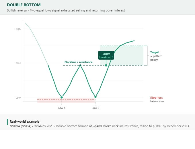
1. Double Bottom
The Double Bottom is one of the most widely recognised and reliable bullish reversal patterns in technical analysis. It forms after a sustained downtrend when price tests the same support level twice, creating two distinct lows at a similar price point — the characteristic "W" shape on the chart. Between the two lows sits a peak, known as the neckline, which acts as the key resistance level the price must break above to confirm the pattern.
The psychology behind the double bottom is straightforward and powerful. On the first decline, sellers are in control and push price to a new low. Then buyers step in, pushing price back up to the neckline. The second decline tests the same low, but crucially, sellers cannot push it lower — they have exhausted their momentum. Buyers absorb the selling pressure and drive price upward again. When price breaks above the neckline, it signals a genuine shift in control from sellers to buyers.
Volume is an important confirmation tool here. Ideally, the second bottom forms on lighter volume than the first, suggesting sellers are losing conviction, while the breakout above the neckline should occur on a volume spike, confirming real buying interest rather than a trap.
The double bottom appears regularly across all timeframes and asset classes. It is particularly common at major market bottoms, and spotting one on a weekly or monthly chart can signal significant trend reversals rather than short-term bounces.
How to trade it:
Enter on a confirmed breakout above the neckline — ideally on the candle close above it rather than intraday. Set your stop-loss just below the lowest of the two lows to allow for noise without exposing you to undue risk. Your initial profit target is calculated by measuring the height from the lowest low to the neckline and projecting that distance upward from the breakout point. More aggressive traders may extend targets if price action and volume support continued momentum.
Common mistakes:
The most frequent error is entering on the second low itself, anticipating the pattern before it has confirmed. The second low could continue into a new downtrend — the neckline breakout is the confirmation, not the low. Also watch for false breakouts above the neckline: a candle close, not just an intraday spike, is your trigger.
Best timeframes and markets:
The double bottom is reliable across all timeframes but carries more weight on higher timeframes (4H, daily, weekly). It appears regularly in stocks, forex pairs, and crypto — anywhere that trends and reversals occur.
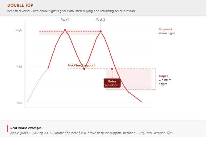
2. Double Top
The Double Top is the bearish mirror of the double bottom — one of the most reliable bearish reversal patterns available to technical traders. It forms after a sustained uptrend when price tests the same resistance level twice, creating two peaks at a similar price with a trough — the neckline — between them. The "M" shape it creates on a chart is immediately recognisable and signals that buyers have twice failed to push price higher, while sellers have successfully defended the resistance zone.
The underlying psychology is equally clear. On the first push to the high, buyers are in control — but sellers step in and push price back down to the neckline. Buyers try again on the second rally, but once more, sellers overpower them. When price falls back through the neckline on the second decline and closes below it, it confirms that control has shifted to the sellers and a new downtrend is likely beginning.
The distance between the two peaks matters. A very wide separation — weeks or months between them — tends to produce more reliable breakdowns than two peaks formed within a few days, because it signals a sustained struggle at resistance rather than short-term noise. Similarly, peaks that are approximately equal in height (within a few percentage points) carry more weight than peaks with a significant gap between them.
How to trade it:
Enter short when price closes below the neckline on meaningful volume. Place your stop-loss just above the higher of the two peaks to protect against a false breakdown. Your initial target is calculated by measuring the height from the peaks to the neckline and projecting that distance downward from the breakdown point.
Common mistakes:
Shorting at the second peak before the neckline has broken is the primary error — you are fighting the trend until the pattern confirms. The neckline break is everything. A close below it, not a brief intraday dip, is your trigger.
Best timeframes and markets:
Highly effective on daily and weekly charts for stocks and indices. In forex and crypto, the double top appears frequently on 1H and 4H charts during trend reversals at key resistance zones.
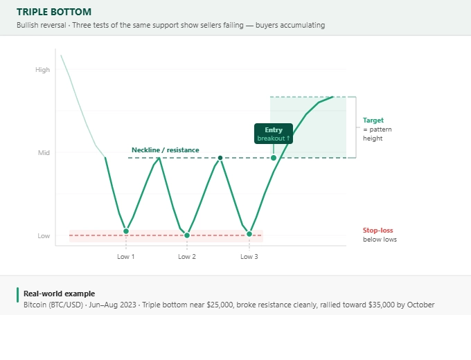
3. Triple Bottom
The Triple Bottom is a bullish reversal pattern that forms when price tests the same support level three times without breaking below it, creating three clear lows at a similar price point. It is a more drawn-out version of the double bottom, and by virtue of the extra test of support, it is often considered an even stronger signal — sellers have had three opportunities to push price lower and failed each time.
Each failed test of the support level reinforces its strength. As the market rebounds from the third low and moves back toward the neckline — the resistance level formed by the peaks between the lows — the balance of power is shifting clearly in favour of buyers. A confirmed break above the neckline completes the pattern and signals the start of a new uptrend.
The time it takes for a triple bottom to form matters. Patterns that develop over weeks or months on daily or weekly charts tend to be more significant than those that form over a few hours on an intraday chart. The longer the market has tested and respected a support level, the more meaningful the eventual breakout when it comes.
One nuance worth noting: the three lows do not need to be identical — a variation of a few percent is normal. What matters is that each low is relatively close to the others and that price has clearly bounced from the same general area three times.
How to trade it:
Enter long when price closes above the neckline. Set your stop-loss below the lowest of the three lows. Your profit target is measured by taking the height from the lows to the neckline and projecting it upward from the breakout point. Because the pattern is longer in duration, it often produces a sustained move once it resolves.
Common mistakes:
Buyers sometimes jump in at the third low, reasoning that three tests of support means it will hold again. This is a valid mean-reversion trade but it is not a triple bottom trade — the pattern requires the neckline to break. Also, be cautious if the three lows show declining volume on each bounce, as this can indicate weakening buyer interest rather than accumulation.
Best timeframes and markets:
The triple bottom is most powerful on daily and weekly charts. It appears across equities, indices, forex, and crypto — wherever significant support zones form.
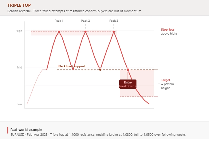
4. Triple Top
The Triple Top is a bearish reversal pattern that forms after a sustained uptrend when price tests the same resistance level three times without breaking through. Three peaks at a similar price level signal that buyers have repeatedly attempted and failed to push price higher — a clear sign that resistance is firm and selling pressure is intensifying with each failed attempt.
As with the triple bottom, the strength of this pattern lies in the repetition. The market has given buyers three chances to break through resistance and they have failed each time. When price finally falls through the neckline — the support level connecting the troughs between the three peaks — the conviction behind the breakdown is typically strong, often producing a sustained downtrend.
Volume behaviour is an important clue. Each successive peak ideally forms on declining volume, suggesting that buyer enthusiasm is waning with each attempt. The neckline breakdown, by contrast, should occur on rising volume, confirming that sellers are genuinely in control rather than buyers simply pausing before another attempt.
It is worth distinguishing the triple top from a period of horizontal consolidation. If price is repeatedly hitting resistance without strong downside moves in between, it may be building energy for a breakout rather than forming a reversal — context matters. The triple top is only confirmed as a bearish reversal when the neckline gives way.
How to trade it:
Enter short on a close below the neckline. Place your stop-loss just above the highest of the three peaks. Your target is the distance from the peaks to the neckline projected downward from the breakdown point.
Common mistakes:
Attempting to short at the third peak is a common but risky approach — price could break above resistance instead. Waiting for the neckline to break is the disciplined approach. Also, watch for retests of the broken neckline from below, which can provide a lower-risk entry on the pullback after the initial breakdown.
Best timeframes and markets:
The triple top is most significant on higher timeframes (daily and weekly). It appears across all markets but is particularly common in forex pairs at major round-number or long-established resistance levels.
5. Inverted Head and Shoulders
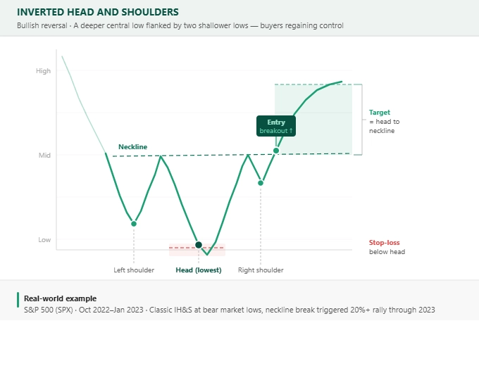
The Inverted Head and Shoulders is widely considered one of the most reliable bullish reversal patterns in technical analysis, and for good reason — it represents a clearly defined shift in market structure from lower lows to higher lows, which is precisely what a trend reversal looks like at the structural level. It forms with three troughs: the first is a moderate low (the left shoulder), followed by a deeper low (the head), and then a higher low on the recovery (the right shoulder). The neckline connects the two peaks between these troughs.
The pattern tells a story of exhausted selling. Price makes a new low at the head, but when sellers push again to form the right shoulder, they cannot reach the same depth. This is a significant clue: sellers are losing momentum. Buyers begin to absorb more of the supply, and when price finally breaks above the neckline, the shift in control is confirmed.
The right shoulder is an important detail. A right shoulder that forms higher than the left is actually a positive sign — it shows that buyers are stepping in sooner with each decline. A right shoulder that forms lower than the left (or that approaches the depth of the head) weakens the pattern and should prompt caution.
The neckline itself does not need to be perfectly horizontal. A slight upward slope is common and acceptable — it reflects the gradual improvement in buyer confidence. A downward-sloping neckline is less ideal and tends to produce weaker breakouts.
How to trade it:
Enter long on a candle close above the neckline, ideally accompanied by rising volume. Set your stop-loss below the right shoulder (conservative) or below the head (wider stop, more room). Target is the distance from the head to the neckline, projected upward from the breakout point.
Common mistakes:
Entering during the formation of the right shoulder rather than waiting for the neckline break. The right shoulder can extend into a new low — patience is essential. Also watch for retests of the neckline after the initial breakout, which are common and often offer excellent second-entry opportunities.
Best timeframes and markets:
Highly reliable on daily and weekly charts across stocks, indices, and forex. One of the most traded patterns by institutional players, which adds to its self-fulfilling reliability at key market turning points.
6. Head and Shoulders
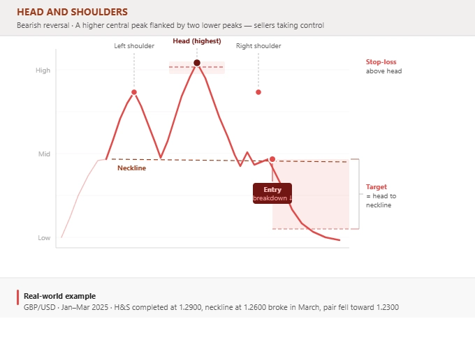
The Head and Shoulders is arguably the most famous chart pattern in technical analysis and one of the most reliable bearish reversal patterns available. It forms after a sustained uptrend with three peaks: the left shoulder, the higher head, and the right shoulder. The neckline — drawn across the two troughs between the peaks — is the critical level to watch.
The pattern encapsulates a textbook shift in market structure. Buyers initially push to a new high (the head), but sellers push price back down to the neckline. Buyers make one more attempt with the right shoulder, but this time they cannot reach the same height as the head — a sign that buying momentum is genuinely fading. When price falls through the neckline and closes below it, the pattern is complete and the downtrend begins.
The right shoulder is particularly telling. If it forms at a significantly lower level than the left shoulder, it is an indication that sellers are stepping in earlier and more aggressively with each rally. This tends to produce sharper and more sustained breakdowns. A right shoulder that almost matches the head in height suggests weaker conviction from sellers and warrants caution.
Because the head and shoulders is so widely recognised, it attracts significant institutional attention. Professionals watch for the neckline break and often set orders both for the initial breakdown and the subsequent retest of the neckline from below — the latter often being the safer and more reliable entry for traders who missed the initial move.
How to trade it:
Enter short on a confirmed close below the neckline on rising volume. Set your stop-loss just above the right shoulder (conservative) or the head (wider). Target is measured from the head to the neckline, projected downward from the breakdown point. Watch for retests of the neckline as a potential second entry.
Common mistakes:
The most dangerous mistake is entering short during the formation of the right shoulder, before the neckline breaks. Right shoulders can extend significantly — price could rally back to the head before eventually confirming the pattern. Volume confirmation on the breakdown is also critical: a neckline break on thin volume is a red flag.
Best timeframes and markets:
One of the most effective patterns on daily and weekly charts across all asset classes. Particularly well-documented in equities, major forex pairs, and indices, where institutional order flow tends to amplify the pattern's reliability.
7. Ascending Triangle
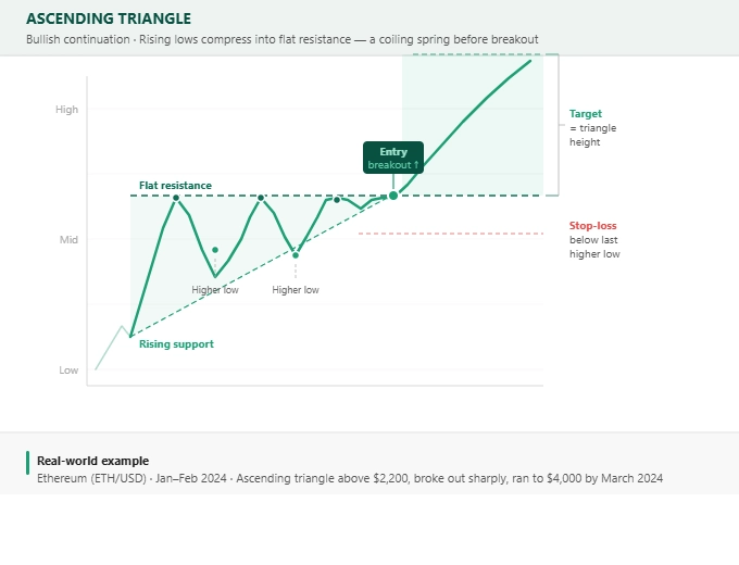
The Ascending Triangle is a bullish continuation pattern that forms when price consolidates between a flat resistance level above and a rising support trendline below. The pattern represents a market in which buyers are gradually becoming more aggressive — each pullback is shallower than the last, as buyers step in at progressively higher prices. Meanwhile, sellers are holding a consistent resistance level, but with each test, there are fewer sellers willing to hold the line.
Think of it like a compressed spring. Each time buyers push to resistance, sellers absorb some of the supply. But the higher lows show that buyers are becoming increasingly impatient — they are not waiting for lower prices before buying. Eventually, the supply at resistance is exhausted and the breakout follows.
Volume patterns inside the ascending triangle are informative. As the pattern develops, overall volume often contracts — the market is in a holding pattern and neither side is committing. When the breakout comes, a significant volume surge is the hallmark of a genuine move rather than a fake-out. The best breakouts are accompanied by volume that is noticeably above the average seen during the pattern's formation.
It is worth noting that although the ascending triangle is classified as a bullish pattern, it can occasionally break to the downside. If the rising support line breaks before the flat resistance does, treat it as a bearish signal and do not assume the upside breakout is still coming.
How to trade it:
Enter long on a close above the flat resistance line on strong volume. Place your stop-loss just below the most recent higher low. Your target is the maximum height of the triangle at its widest point, projected upward from the breakout.
Common mistakes:
Entering on the fourth or fifth touch of the resistance line before a breakout has been confirmed. Repeated touches of resistance can look compelling but price could still reverse. Wait for the confirmed close above resistance. Also, be cautious of breakouts that occur very close to the apex — these tend to be weaker as the pattern has run out of energy.
Best timeframes and markets:
Highly effective on 1H, 4H, and daily charts. Common in growth stocks, crypto, and trending forex pairs. The ascending triangle that forms within an established uptrend carries significantly more weight than one that forms in isolation.
8. Descending Triangle
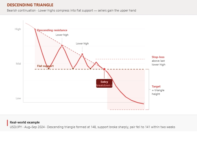
The Descending Triangle is the bearish counterpart to the ascending triangle and one of the most recognisable bearish continuation patterns in technical analysis. It forms when price consolidates between a flat support level and a descending resistance trendline — each rally reaches a lower high than the last, while the support level holds. The pattern reflects a market in which sellers are increasingly aggressive, stepping in at lower and lower prices, while buyers are defending the same level but losing the battle.
The lower highs tell the story clearly. With each bounce off support, sellers cut the rally shorter. Buyers are defending support, but fewer of them are buying, and the ones who are buying are getting in at lower and lower prices. Eventually, the support level cannot hold. When it breaks, the accumulated selling pressure — compressed over the course of the pattern — tends to produce a sharp and sustained move lower.
As with the ascending triangle, volume is a key confirming factor. Volume during the pattern tends to contract as the market consolidates. A support break on high volume is a strong confirmation signal; a break on low volume is more likely to be a false breakdown, after which price may recover above support.
Note that like the ascending triangle, the descending triangle can occasionally break to the upside. If the descending resistance trendline breaks to the upside while support holds, treat it as a bullish signal.
How to trade it:
Enter short on a confirmed close below the flat support line on above-average volume. Set your stop-loss just above the most recent lower high. Your target is the maximum height of the triangle, projected downward from the breakout point.
Common mistakes:
Anticipating the breakdown before it happens and shorting into support is the most common error. Support can hold far longer than expected, and premature entries get stopped out before the actual breakdown occurs. Wait for the close below support.
Best timeframes and markets:
Effective on 1H, 4H, and daily charts. Common in downtrending equities, bearish crypto markets, and forex pairs in established downtrends. The descending triangle that forms after a significant breakdown from a higher structure carries particular weight.
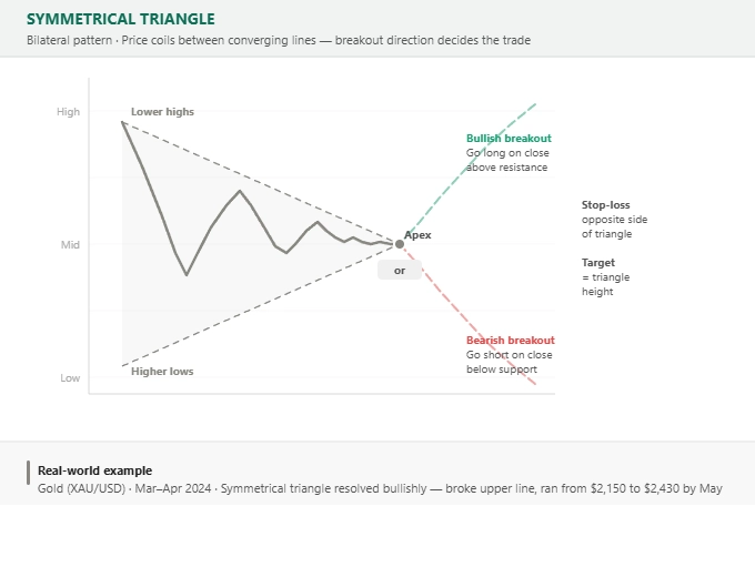
9. Symmetrical Triangle
The Symmetrical Triangle is genuinely neutral — a bilateral pattern that forms when price creates a series of lower highs and higher lows, producing two converging trendlines that meet at the apex. Unlike the ascending or descending triangle, neither buyers nor sellers have a clear advantage during the pattern's formation. Both sides are making concessions, compressing price into a tighter and tighter range, until the pressure builds to a point where a decisive breakout becomes inevitable.
The pattern reflects a market in temporary equilibrium — a period of genuine indecision where large participants are accumulating or distributing without yet showing their hand. This is what makes the symmetrical triangle distinct from the directional triangles: you simply do not know which way it will break, and any trader who tells you they do is speculating rather than reading the pattern.
What you can rely on is the breakout itself. When price finally escapes the triangle, it typically does so with conviction — a clear candle close outside one of the trendlines, often accompanied by a noticeable uptick in volume. The prior trend context can offer a mild bias (a symmetrical triangle that forms within a broader uptrend has a slight statistical tendency to break to the upside), but this should not override the wait for confirmed direction.
The timing of the breakout relative to the apex matters. Breakouts that occur at around 60% to 75% of the way through the triangle tend to be the most reliable. Breakouts very close to the apex — where the lines have nearly converged — are often weaker, as the pattern has lost its energy.
How to trade it:
Wait for a confirmed breakout in either direction. Enter on the candle close outside the trendline, set your stop-loss on the opposite trendline, and target a distance equal to the maximum height of the triangle at its widest point, projected from the breakout.
Common mistakes:
The most dangerous mistake is anticipating the direction before the break and entering inside the triangle. This leads to whipsaws as price bounces between the converging lines. Discipline means waiting. Also, be alert to false breakouts — a brief pierce of the trendline followed by a return inside the pattern. Use closing prices, not intraday wicks, as your trigger.
Best timeframes and markets:
Effective across all timeframes. Particularly common ahead of major news events or data releases, when market participants are uncertain and price compresses in anticipation. Appears frequently in forex, indices, and commodities.
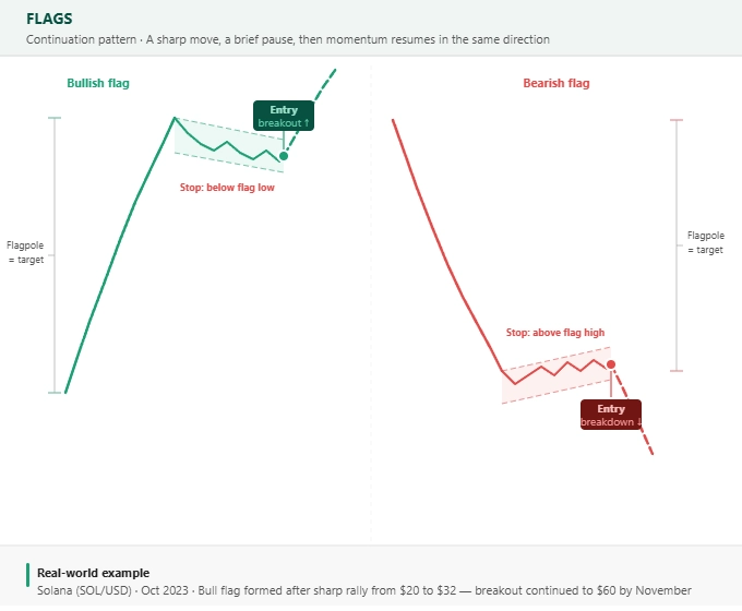
10. Flags
Flags are bullish or bearish continuation patterns that represent one of the cleanest and most tradable setups in technical analysis. They form in two clear stages: a sharp, near-vertical price move (the flagpole), followed by a brief, orderly consolidation that slopes against the direction of the initial move (the flag). The flag phase represents a temporary pause — profit-taking or a reset in momentum — before the original trend reasserts itself and price moves in the direction of the flagpole.
The flagpole is crucial. It must be sharp and nearly vertical to qualify as a flag — a gradual drift upward or downward is not a flagpole, it is just a trend. The steeper and more decisive the flagpole, the better the flag that follows tends to perform. Strong flagpoles reflect strong momentum, and momentum tends to persist.
The flag consolidation itself should be relatively tight and well-bounded by two roughly parallel lines sloping against the trend. If the consolidation is deep — retracing more than 50% of the flagpole — it weakens the pattern significantly. The best flags retrace 30% to 50% of the flagpole at most, ideally on declining volume, showing that the pullback is a lack of sellers rather than an influx of them.
Volume is one of the key differentiators between a flag and a genuine reversal. During the flag consolidation, volume should contract noticeably — the market is taking a breath, not changing direction. When the breakout comes, volume should pick up meaningfully, confirming that the original momentum is returning. A breakout on persistently low volume is a warning sign.
How to trade it:
For a bull flag: enter long on a breakout above the upper boundary of the flag. For a bear flag: enter short on a breakdown below the lower boundary. Set your stop-loss just beyond the opposite boundary of the flag. Your target is the length of the flagpole, projected from the breakout point.
Common mistakes:
Entering during the flag consolidation rather than waiting for the breakout. The flag can extend significantly, and entering early means sitting through the consolidation with no directional edge. Also, be cautious of flags that form on low-liquidity markets or outside of main trading sessions — these are prone to false breakouts.
Best timeframes and markets:
Flags are one of the most versatile patterns, appearing reliably on 15-minute, 1H, 4H, and daily charts. Particularly common and reliable in trending crypto markets, momentum stocks, and forex pairs during strong directional moves. They are a favourite pattern for momentum and swing traders precisely because the setup is clean and the risk-reward is well-defined.
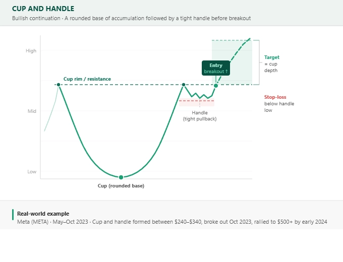
11. Cup and Handle
The Cup and Handle is a bullish continuation pattern with a distinctive shape: a smooth, rounded bottom (the cup) followed by a smaller, tighter consolidation that drifts slightly lower (the handle), before a breakout above the cup's rim level. The pattern was popularised by investor William O'Neil in his 1988 book How to Make Money in Stocks and has since become one of the most studied patterns in equity markets.
The cup represents a period of gradual accumulation. Unlike a V-shaped bottom — which reflects panic and a rapid reversal — the rounded bottom of a cup suggests a slow, orderly transition from sellers to buyers. Smart money is quietly accumulating while the broader market is unaware. The rounding nature of the base reflects this gradual shift: sellers dry up, buyers gradually gain the upper hand, and price slowly recovers toward the rim.
The handle forms after price has returned to the cup's rim level. At this point, some participants who bought near the old high decide to exit, creating a brief pullback — the handle. This handle should be relatively shallow (ideally retracing 30% to 50% of the cup's depth at most) and should form on declining volume. A deep, volatile handle weakens the pattern significantly. The handle is essentially a final shakeout of weak hands before the genuine breakout.
Volume is particularly important in the cup and handle. During the right side of the cup's formation, volume should begin to increase as price approaches the rim, reflecting growing buyer interest. The handle forms on decreasing volume, and the breakout above the rim should ideally be accompanied by the highest volume seen since the start of the cup — a clear signal that the accumulation is complete and a new uptrend is beginning.
How to trade it:
Enter long when price closes above the rim of the cup (the resistance level at the top of both the left and right sides of the cup) on strong volume. Set your stop-loss just below the low of the handle. Your target is the depth of the cup, projected upward from the breakout point.
Common mistakes:
Entering at the base of the cup, anticipating the recovery, is a common trap — price can take weeks or months to return to the rim and could break lower in the meantime. The breakout above the rim is the only confirmed entry signal. Also, a V-shaped cup is a warning sign — the pattern requires a rounded bottom, not a sharp one. A sharp recovery suggests panic buying rather than accumulation, and these patterns tend to be less reliable.
Best timeframes and markets:
The cup and handle is most reliable on weekly charts and is particularly associated with growth stocks and indices. It can appear on lower timeframes in forex and crypto but tends to be most significant — and produce the largest moves — on higher timeframes where genuine institutional accumulation can occur over extended periods.
FREE Charting Patterns Cheat Sheet – Download PDF
How to Trade Using Chart Patterns (Step by Step)
- Spot the Pattern: Look for clear formations like double tops, triangles, or head and shoulders. Crucially, wait for the pattern to fully form before committing — entering early is one of the most common and costly mistakes in pattern trading.
- Confirm It: Use supporting indicators such as volume, moving averages, or RSI to validate the setup. Rising volume on a breakout is one of the strongest confirmation signals available. Patterns that develop against the broader trend require more confirmation than those that align with it.
- Set Entry Points: Enter long when price closes above resistance on a bullish pattern, or enter short when price closes below support on a bearish one. Use closing prices rather than intraday wicks as your trigger to reduce false signals.
- Place a Stop-Loss: Every trade needs a defined stop-loss before entry. For bullish patterns, place your stop below the most recent significant low. For bearish patterns, place it above the most recent significant high. Your stop-loss defines your maximum risk on the trade.
- Target Profits: Measure the height of the pattern (from the key low to the key high, or vice versa) and project that distance from the breakout point. This gives you your minimum target. Some traders use partial take-profits along the way, securing gains as price reaches intermediate levels.
- Track the Trade: Once in a trade, monitor price action and consider trailing your stop-loss to lock in profits as the trade moves in your favour. Do not move your stop against you to give a losing trade more room.
- Exit Smartly: Close at your target, or exit if the pattern invalidates — for example, if price re-enters the pattern after a breakout, or if a key support/resistance level fails to hold. Honouring your plan matters as much as building it.
What is the Role of Support and Resistance in Chart Patterns?
Support and resistance are the foundation on which virtually all chart patterns are built. They mark the price levels where buying or selling interest has historically been strong enough to halt or reverse a move, and they are the key structural features that define where a pattern begins, where it ends, and where the breakout or breakdown occurs.
- Support: A price level where buying interest is strong enough to prevent further decline. In chart patterns, support is often the neckline of a reversal pattern or the lower boundary of a continuation pattern. When support breaks, the character of the move changes entirely.
- Resistance: A price level where selling pressure is strong enough to prevent further advance. In bullish patterns, resistance is the level that price must clear to confirm the setup. In bearish patterns, resistance is where price typically stalls after a breakdown and retests from below.
These levels attract attention because traders remember them. Past turning points become self-fulfilling — when price returns to a level where many participants previously bought or sold, they tend to act similarly again. This collective memory is what gives support and resistance zones their power.
How Do Support and Resistance Tie into Chart Patterns?
Every chart pattern interacts with support and resistance in a specific way. Reversal patterns like double tops and head and shoulders form near significant resistance and signal that sellers are defending that level with increasing conviction. Continuation patterns like flags and ascending triangles consolidate above established support before resuming higher. And bilateral patterns like the symmetrical triangle squeeze price between converging support and resistance until one side prevails.
Understanding which support and resistance levels are most significant — round numbers, prior highs and lows, long-standing horizontal zones, and levels that have been tested multiple times — helps you prioritise which pattern setups are most likely to produce reliable outcomes.
Confirming Chart Patterns with Breakouts
A breakout is the event that confirms a chart pattern. Until price has broken through the key level — the neckline, the trendline boundary, or the resistance zone — the pattern is only developing, not confirmed. Patience at this stage separates consistent traders from impulsive ones.
- Bullish Breakout: Price closes above the key resistance level on rising volume. The closing price is what matters, not an intraday spike. A close above the level shows that buyers have absorbed all the selling at that price and are ready to push higher.
- Bearish Breakout: Price closes below the key support level on rising selling volume. The principle is the same — a close below support confirms that sellers are in control and that the level has genuinely failed.
- False Breakouts: Price momentarily pierces a key level but then reverses back inside the pattern. These are common and can be costly. Using closing prices rather than intraday wicks as your entry trigger significantly reduces exposure to false breakouts. Volume confirmation also helps — a breakout on very low volume is more likely to be false than one accompanied by a meaningful volume surge.
The Psychology Behind Support and Resistance
Support and resistance levels are not just technical constructs — they reflect the collective psychology of market participants. At resistance, traders who bought the prior move are deciding whether to take profits. New buyers are deciding whether the level will hold or break. Short sellers are deciding whether to initiate positions. The interaction of all these decisions at the same price level is what creates the visible pausing and reversing that appears on the chart.
Market memory plays a central role. A level that has acted as support or resistance multiple times becomes increasingly significant precisely because more and more participants have experienced it and will act in anticipation of it. This is why a neckline that has been tested three times will attract more attention — and more decisive action — when it finally breaks than one being tested for the first time.
Why Does Volume Matter in Chart Patterns?
Volume is the single most important confirming tool in chart pattern analysis. Price tells you what is happening; volume tells you how much conviction is behind it. A breakout accompanied by a volume surge is a fundamentally different signal from a breakout on thin volume — the former reflects genuine participation by many market players, the latter may reflect a temporary imbalance that reverses quickly.
During pattern formation, volume typically contracts. The market is in a state of equilibrium or indecision, and neither buyers nor sellers are committing significant capital. This contraction of volume is actually a healthy feature of a developing pattern — it shows consolidation rather than distribution or panic. When volume surges on the breakout, it signals that participants who had been waiting on the sidelines are now committing, and that the move has real backing.
Volume divergence — where price moves in one direction but volume moves in the opposite direction — is also worth monitoring. If price is making new highs within a pattern but volume is declining, it suggests the buyers pushing price higher are doing so with decreasing conviction. This can be an early warning sign that a breakdown is coming even before price itself shows weakness.
In summary: learn to read volume alongside price, not instead of it. The combination of a well-formed pattern, a clean breakout at a significant level, and a clear volume confirmation is as close to a high-probability setup as chart analysis can offer.
How Reliable are these Chart Patterns?
Chart pattern reliability is a subject of genuine debate in technical analysis, and any honest treatment of the topic requires acknowledging that no pattern works all the time. Studies on historical chart pattern performance — most notably the extensive research in Thomas Bulkowski's Encyclopedia of Chart Patterns — suggest that patterns are genuinely predictive on average, but with significant variation depending on market conditions, timeframe, and whether the pattern is confirmed with volume.
[ninja_tables id="25421"]
As a general framework: reversal patterns on higher timeframes (daily and weekly) with clear volume confirmation have historically shown the highest reliability. Continuation patterns in strongly trending markets outperform the same patterns in choppy or sideways markets. And all patterns perform worse when traded against the broader macro trend than when they align with it.
The practical implication is that chart patterns should be used as one input among several, not as a standalone system. A head and shoulders pattern that forms at a major weekly resistance level, in an overbought RSI environment, during a broader market downtrend, with a volume surge on the neckline break, is a fundamentally different signal from the same pattern forming in isolation on a 15-minute chart with no other confluence.
What are the Limitations of Chart Patterns?
Understanding the limitations of chart patterns is as important as understanding the patterns themselves. The first and most significant limitation is subjectivity — pattern identification is not a precise science, and two experienced traders looking at the same chart can sometimes disagree on whether a pattern even exists, let alone how to trade it. This subjectivity means that mechanical rules need to accompany any pattern-based approach.
False breakouts represent the second major limitation. Price regularly pierces key levels — necklines, trendline boundaries, resistance zones — only to reverse back inside the pattern. This is a natural feature of markets and reflects the ongoing battle between buyers and sellers, but it is also the source of many losses for traders who enter breakouts aggressively without waiting for confirmation.
In volatile or illiquid markets, chart patterns become significantly less reliable. Volatility creates noise that distorts pattern shapes and produces erratic breakouts. Low liquidity can mean that a large single order appears to break a key level, triggering stops and entry orders, before price quickly reverses to its previous range — a classic stop hunt.
Finally, chart patterns are backward-looking by definition. They are formed by historical price data, which means they always describe something that has already happened. The breakout is the market's attempt to signal what comes next, but the future is genuinely uncertain. No pattern, however well-formed or well-confirmed, is a guarantee. Sound position sizing and disciplined stop-loss management remain essential regardless of how compelling the setup appears.
What External Factors Can Affect Chart Patterns?
Chart patterns do not exist in a vacuum. A technically perfect pattern can fail completely if it forms in the wrong market environment, and conversely, a messy-looking pattern can produce a spectacular move if the broader context strongly supports it. Understanding the external factors that influence pattern reliability is essential for separating high-probability setups from high-risk ones.
- Trend Strength: Patterns that align with the dominant trend are significantly more reliable than those that trade against it. A bull flag forming in a clear, well-established uptrend has the wind behind it; the same pattern forming in a choppy, directionless market is much more likely to fail. Always assess the broader trend before committing to a pattern setup.
- Market Sentiment: Scheduled news events — central bank decisions, earnings releases, employment data, inflation figures — can completely override technical setups regardless of how well-formed they are. A breakout that occurs in the hour before a major news release is high-risk; the news can reverse the move instantly. Monitoring the economic calendar alongside your technical analysis is not optional if you want to trade patterns consistently.
- Liquidity and Volume: Patterns that form in high-liquidity, high-volume markets produce cleaner, more reliable setups than those in thinly traded markets. The major forex pairs, blue-chip stocks, leading indices, and the largest cryptocurrencies by market capitalisation all tend to produce more reliable patterns than smaller, less liquid instruments where a single large order can distort the picture significantly.
- Time Frames: Higher timeframes consistently produce more reliable patterns than lower ones. A head and shoulders on a weekly chart reflects weeks or months of genuine market structure and institutional positioning; the same pattern on a 5-minute chart reflects minutes of activity that can be overridden by almost any external event. This does not mean intraday patterns are untradeable, but they require tighter stops, faster execution, and more context from higher timeframes.
- Sector and Market Context: For equity traders, the broader sector and market environment matters. A stock forming a perfect cup and handle in a sector that is broadly selling off faces a headwind that reduces the pattern's reliability. The same pattern in a sector with strong momentum and broad buying interest has meaningful tailwinds. Always consider the macro picture before committing to a pattern trade.
Final Thoughts and FREE Charting Patterns Cheat Sheet
We have covered 11 essential chart patterns every trader should know in 2026 — how to identify them, how to trade them with defined entry, stop-loss, and target levels, and when they are most likely to be reliable. Each pattern reflects a specific dynamic in the battle between buyers and sellers, and understanding that psychology is what transforms pattern recognition from a mechanical exercise into genuine market insight.
The most important lesson from this guide is not the patterns themselves but the discipline required to trade them correctly. Waiting for confirmation rather than anticipating. Using volume to validate, not just price. Placing stop-losses before you enter, not after. And recognising that no pattern — however textbook-perfect — is a guarantee. The edge in chart pattern trading comes from consistency, context, and risk management, applied over a large number of setups.
Use the patterns you have learned as a framework for reading market structure. Combine them with your understanding of support and resistance, the broader trend, and the market context you are trading in. And keep practising on a demo account or with small position sizes as you build confidence in identifying and trading these setups in real market conditions.
You can find our free Charting Patterns cheat sheet here: Download PDF
FAQ
What is the most reliable chart pattern for beginners?
The Double Bottom is an excellent starting point for beginners. It is visually clear, forms after a defined downtrend, and has a straightforward trading approach with a clear entry (neckline breakout), stop-loss (below the lows), and target (height of the pattern). Its "W" shape is easy to identify and provides a solid foundation for learning how support levels and breakouts work in practice.
How do I confirm a chart pattern before trading?
The primary confirmation is a candle close beyond the key level — the neckline, trendline boundary, or resistance zone. Beyond that, look for a meaningful surge in volume on the breakout (not just an intraday spike), confirmation from momentum indicators like RSI that the move has conviction, and alignment with the broader trend direction. The more confluence factors pointing in the same direction, the higher the probability of a successful setup.
What are the risks of trading chart patterns?
The key risks are false breakouts (price pierces a key level but then reverses), subjective pattern identification (two traders may read the same chart differently), and the inherent backward-looking nature of the patterns. To manage these risks, always wait for a candle close beyond the key level rather than reacting to intraday moves, use stop-losses on every trade without exception, and avoid pattern setups that conflict with the broader market environment.
Can chart patterns work in any market condition?
Chart patterns perform best in trending markets, where the pattern fits naturally into the flow of price action. In strongly sideways or highly volatile markets, patterns frequently produce false breakouts and fail to follow through. The solution is not to avoid patterns entirely in such conditions, but to require more confirmation before entering and to use tighter stops. Adapting your approach to the prevailing market environment is the mark of a consistent pattern trader.
Do professional traders use chart patterns?
Yes — chart patterns are used at all levels of the market, from retail traders to professional fund managers and institutional traders. The head and shoulders, double top, and ascending triangle in particular are so widely followed that they have a degree of self-fulfilling validity: when enough market participants are watching the same level and have orders clustered around it, the pattern can reinforce itself simply through the weight of those positions. This is one reason why the most well-known patterns on high-liquidity instruments and higher timeframes tend to perform better than obscure patterns on small-cap stocks or in illiquid markets.
What is the difference between a chart pattern and a candlestick pattern?
A chart pattern refers to a formation that develops over multiple price bars or candles — a head and shoulders, for example, can take weeks or months to form. A candlestick pattern, by contrast, is a signal formed by one, two, or three individual candles that provides a short-term indication of sentiment — such as a hammer, engulfing candle, or doji. The two approaches are complementary: chart patterns provide the structural context, while candlestick patterns can offer precise entry timing within that context.
References
- Bulkowski, Thomas N. (2005). Encyclopedia of Chart Patterns (2nd Edition). John Wiley & Sons. – The definitive reference on chart pattern statistics, covering historical success rates and performance data for over 60 patterns across bull and bear markets.
- O'Neil, William J. (1988). How to Make Money in Stocks. McGraw-Hill. – The source for the Cup and Handle pattern; O'Neil's CANSLIM methodology remains influential in growth stock technical analysis.
- Nison, Steve. (1991). Japanese Candlestick Charting Techniques. New York Institute of Finance. – Foundational text on candlestick patterns; provides essential context for identifying entry signals within larger chart pattern setups.
- TradingView – Ideas and Scripts – The leading retail charting platform used by millions of traders globally for real-time chart pattern identification.
- StockCharts – ChartSchool: Technical Analysis – Comprehensive free educational resource covering chart patterns, technical indicators, and analytical methodology.
- Fidelity – Technical Analysis: Chart Patterns
- MetaTrader 4/5 – Trading Pattern Tools and Plugins
- eToro Academy – Technical Analysis Guide
61% of Retail CFD Accounts Lose Money
